Miller & Marc
Miller & Marc
Retail Design
COORDINATION has completed the first German flagship store for the Spanish eyewear brand MILLER & MARC in Berlin.
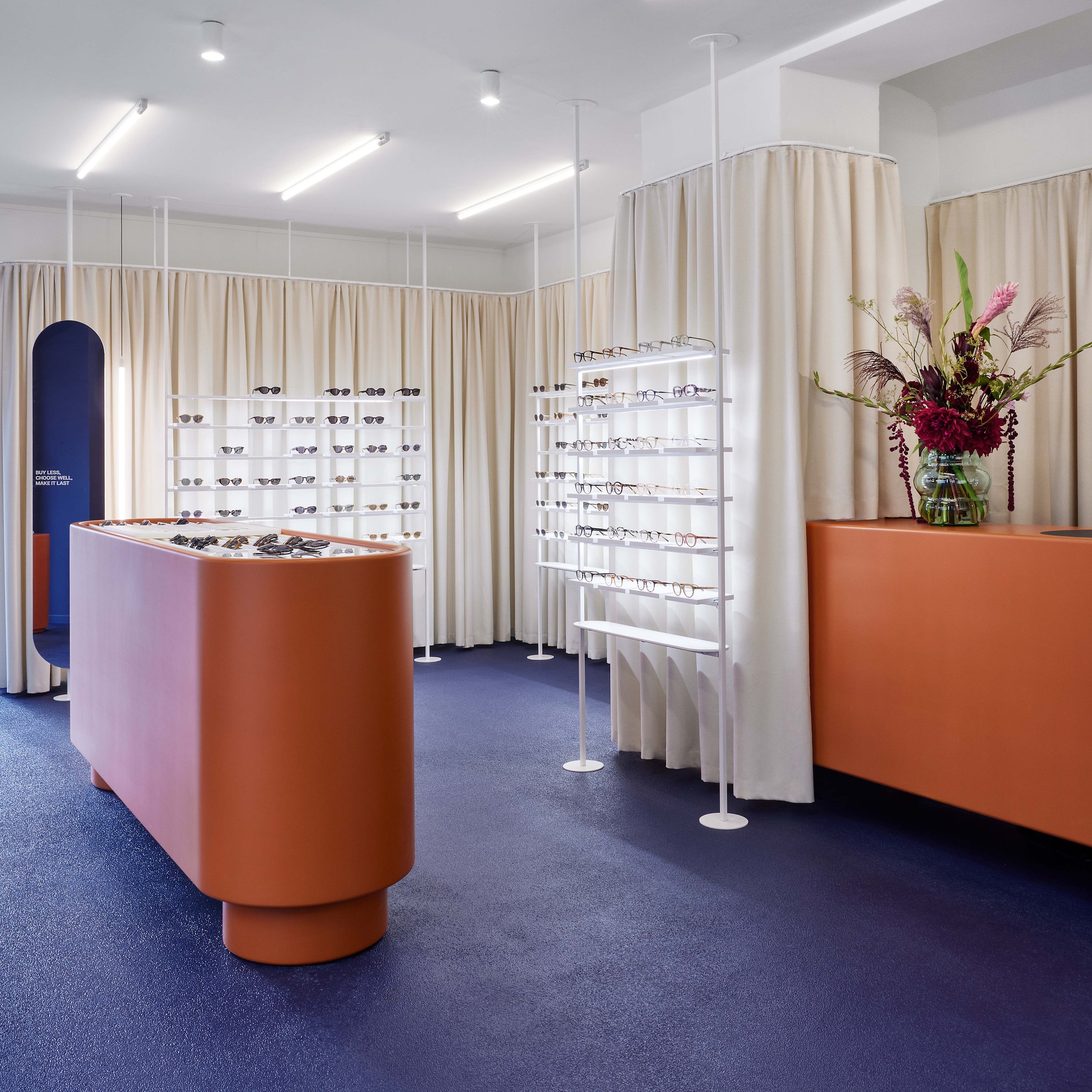
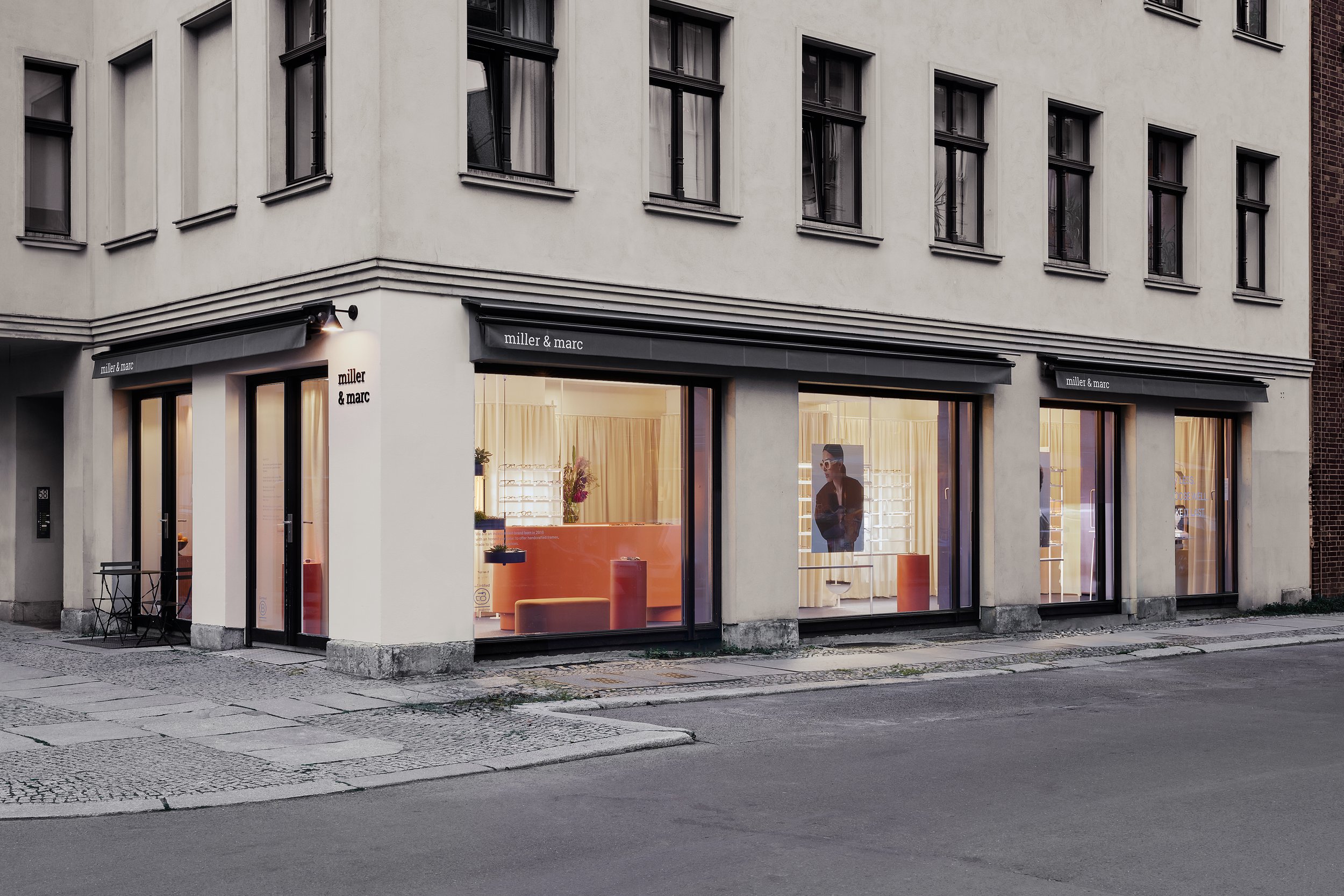
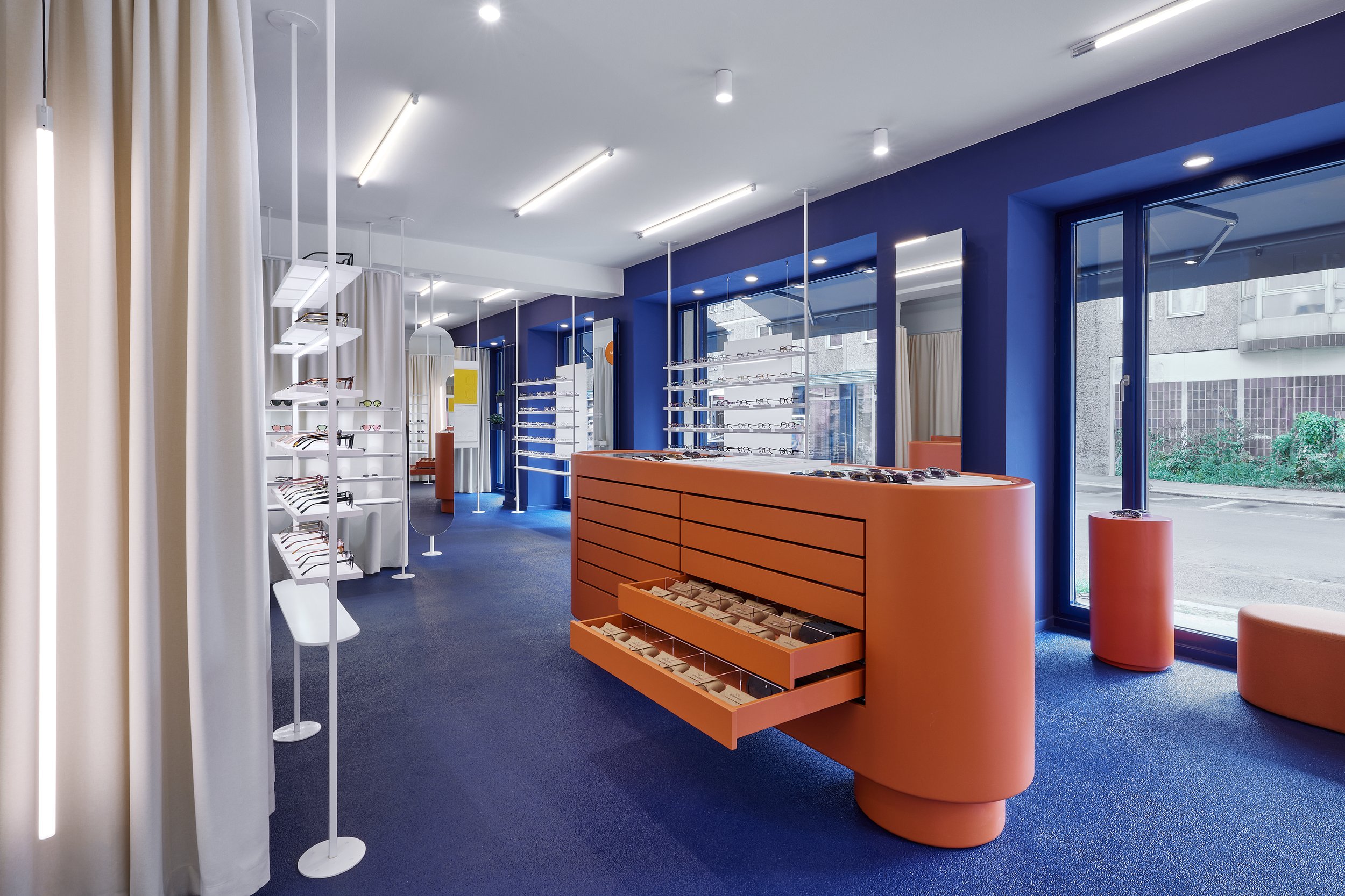
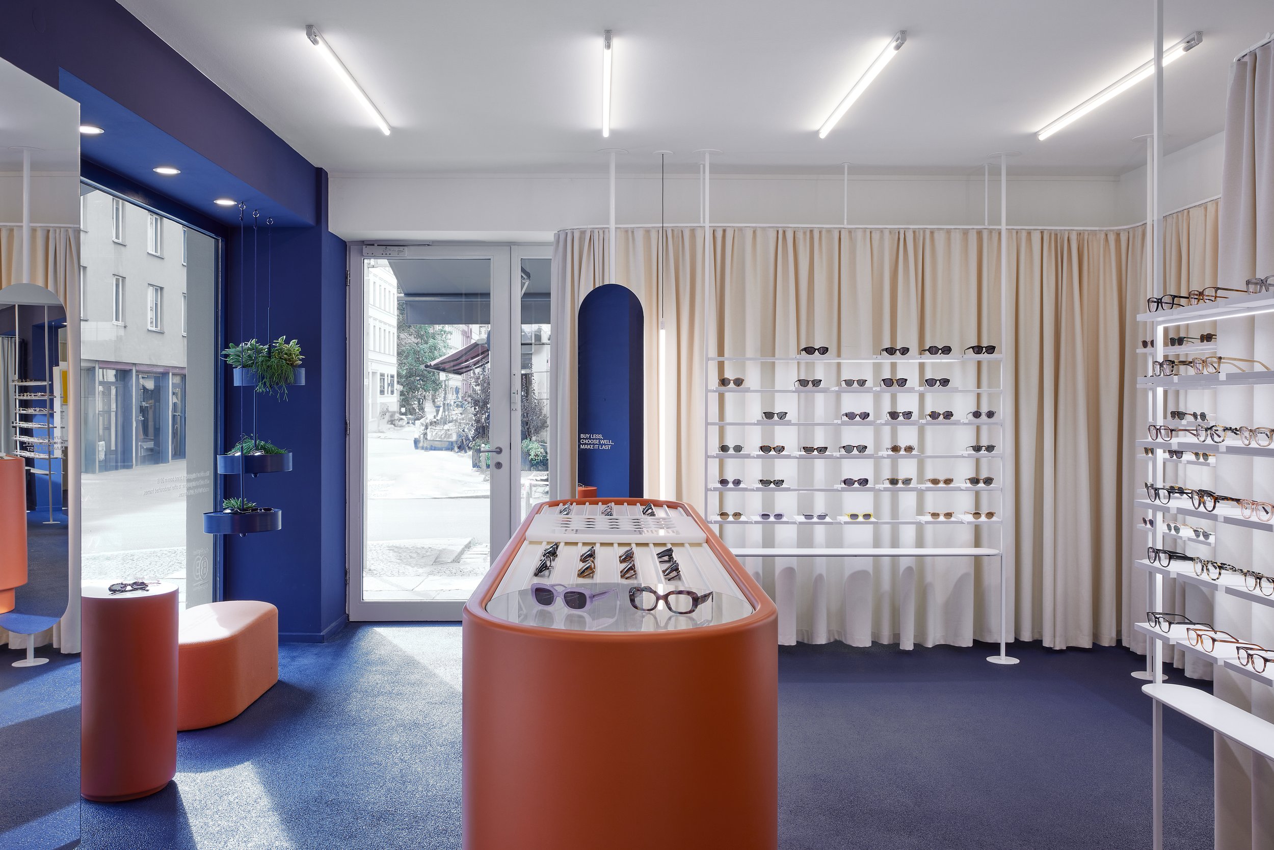
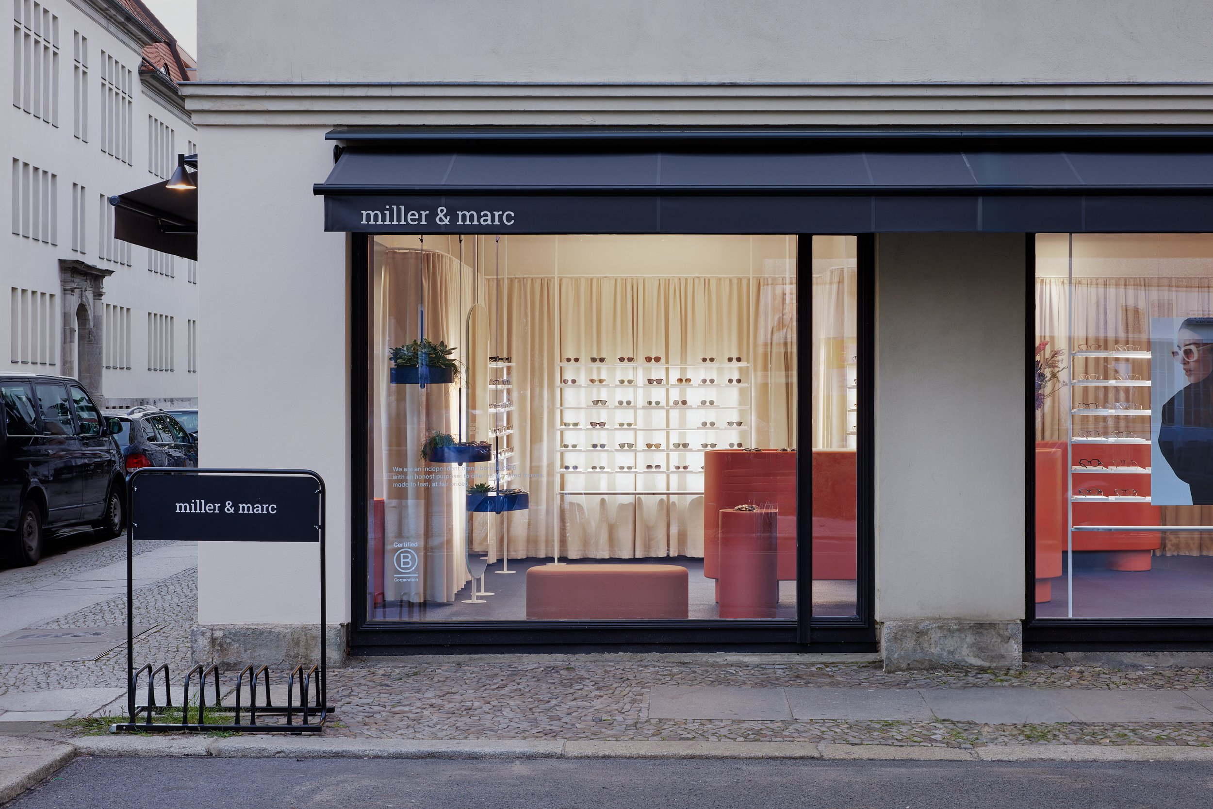
The new store on Auguststraße - a well renowned hotspot of Berlin Mitte - reveals a distinctive retail design that is inspired by the vibrant terracotta and blue hues of Spain while nodding to the Berlin Brutalism of the 1970s/80s.
COORDINATION created a stimulating and authentic space that celebrates the brand‘s Spanish roots as well as the cultural heritage of the city of Berlin and that elegantly showcases the brand‘s range of contemporary eyewear in an accessible way.
Read more
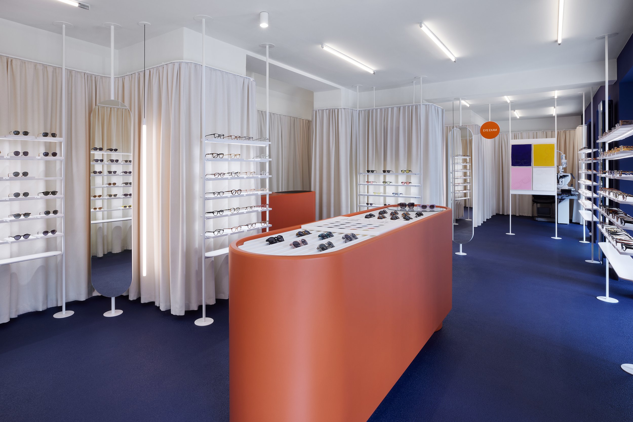
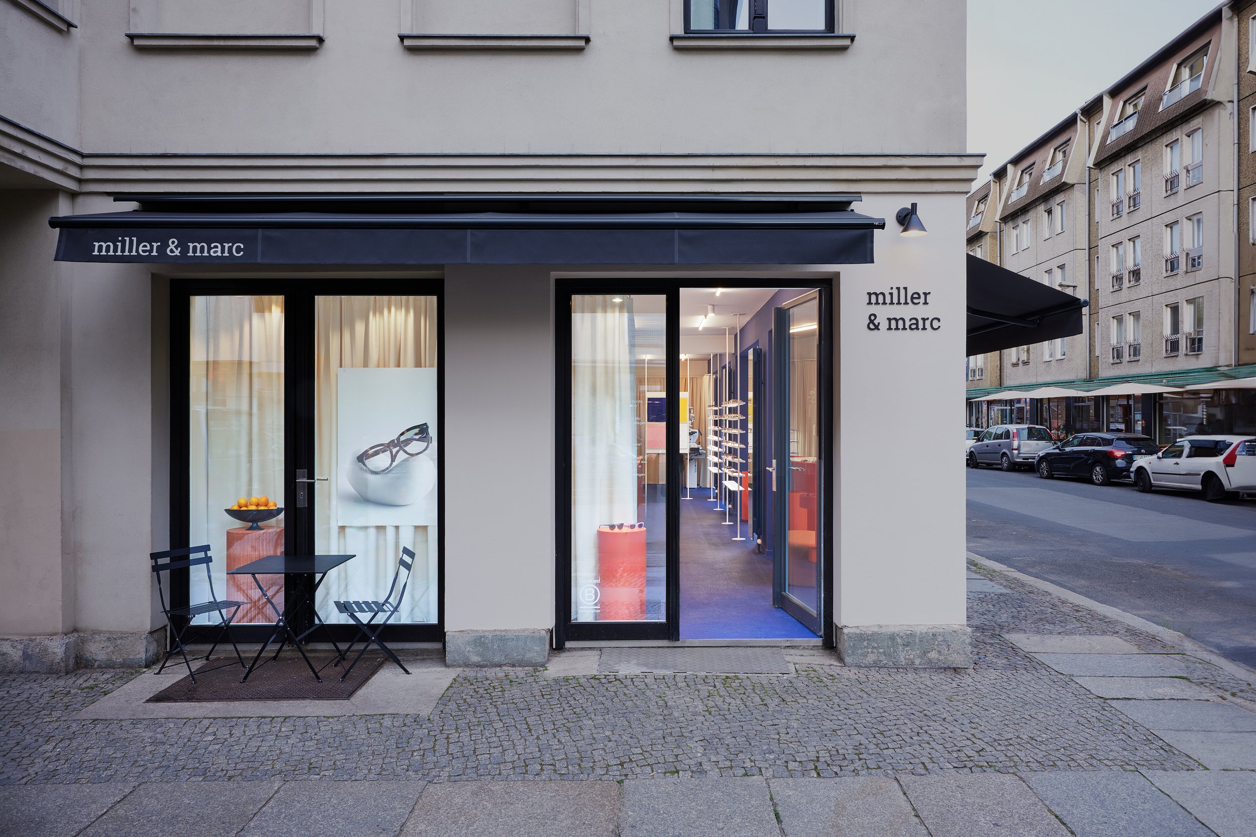
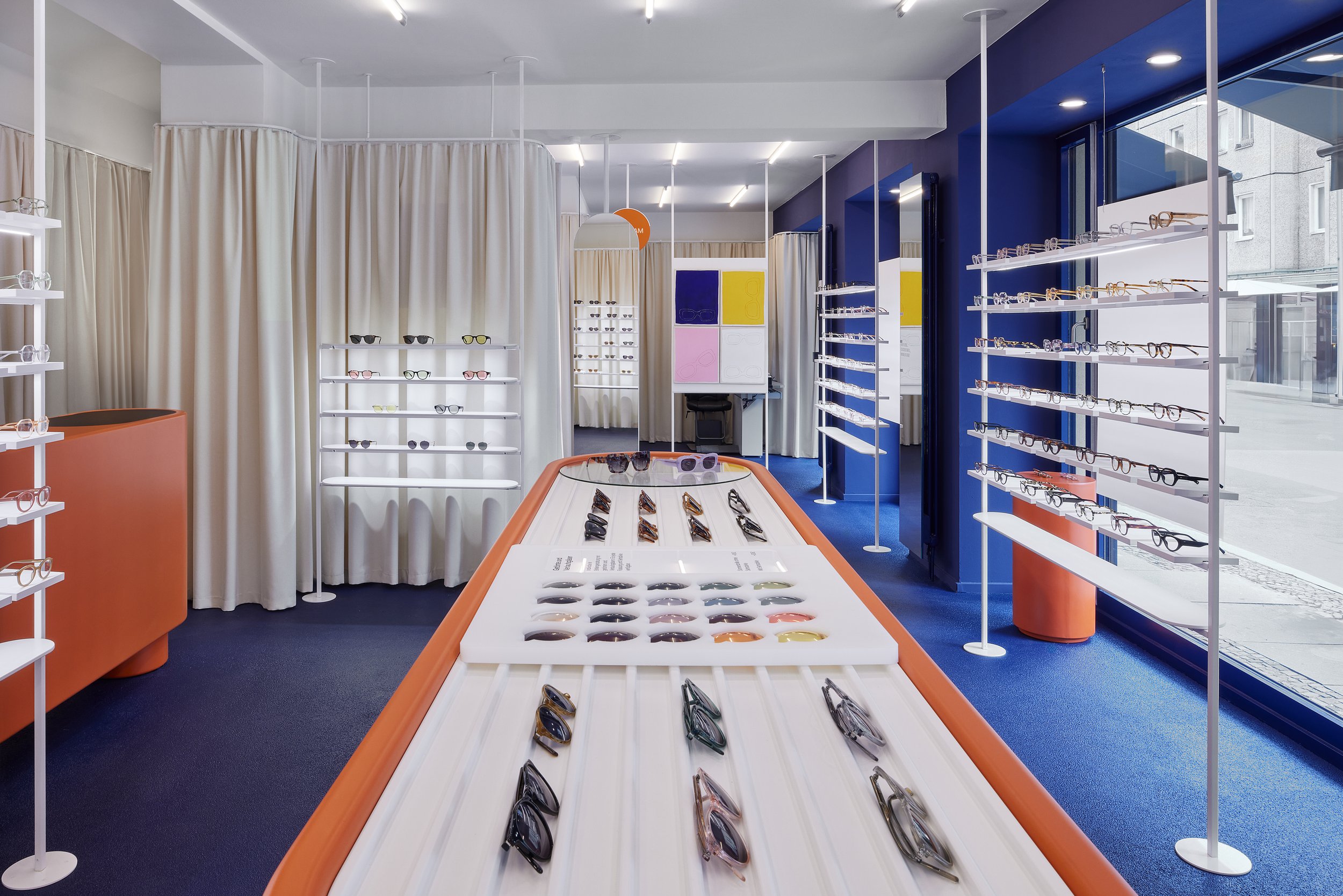
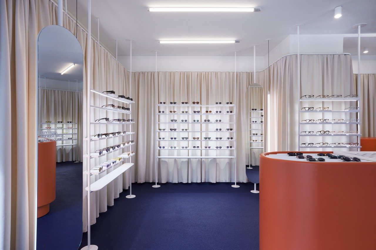
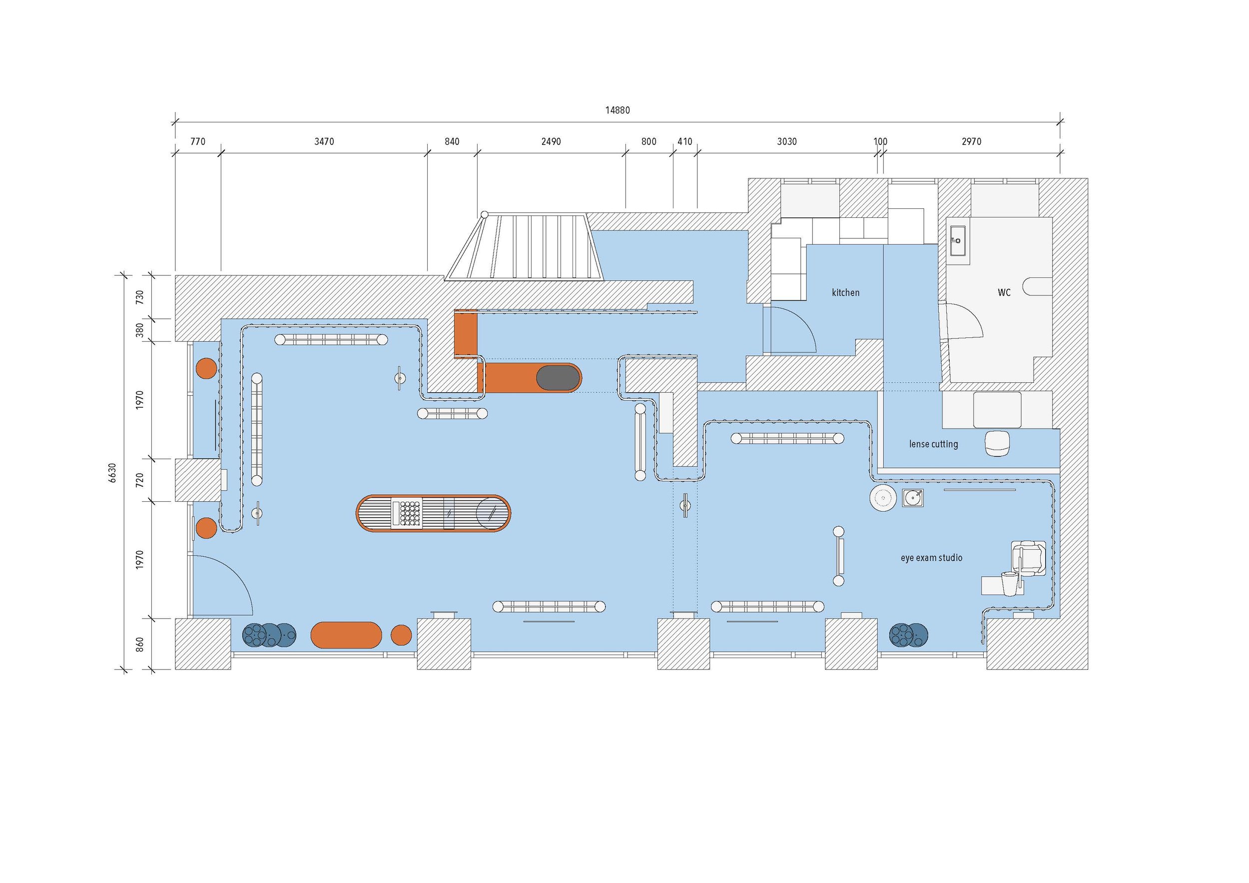
The brand‘s first flagship store in Germany covers 88m2 and is located on Auguststraße in Berlin Mitte. The large window fronts provide a first glimpse of the unique interior of the boutique from the outside: A vibrant colour range that sets warm terracotta shades against a deep cobalt blue attracts visitors to the open-plan retail space, creating an elegantly Mediterranean feel with a neo-brutalistic twist. The retail design thus refers to the Spanish brand‘s origin.
The aim of the design was to create an atmospheric space that allows the Spanish origin of the MILLER & MARC brand to enter into an exciting dialogue with Berlin while using as few means and interventions as possible.
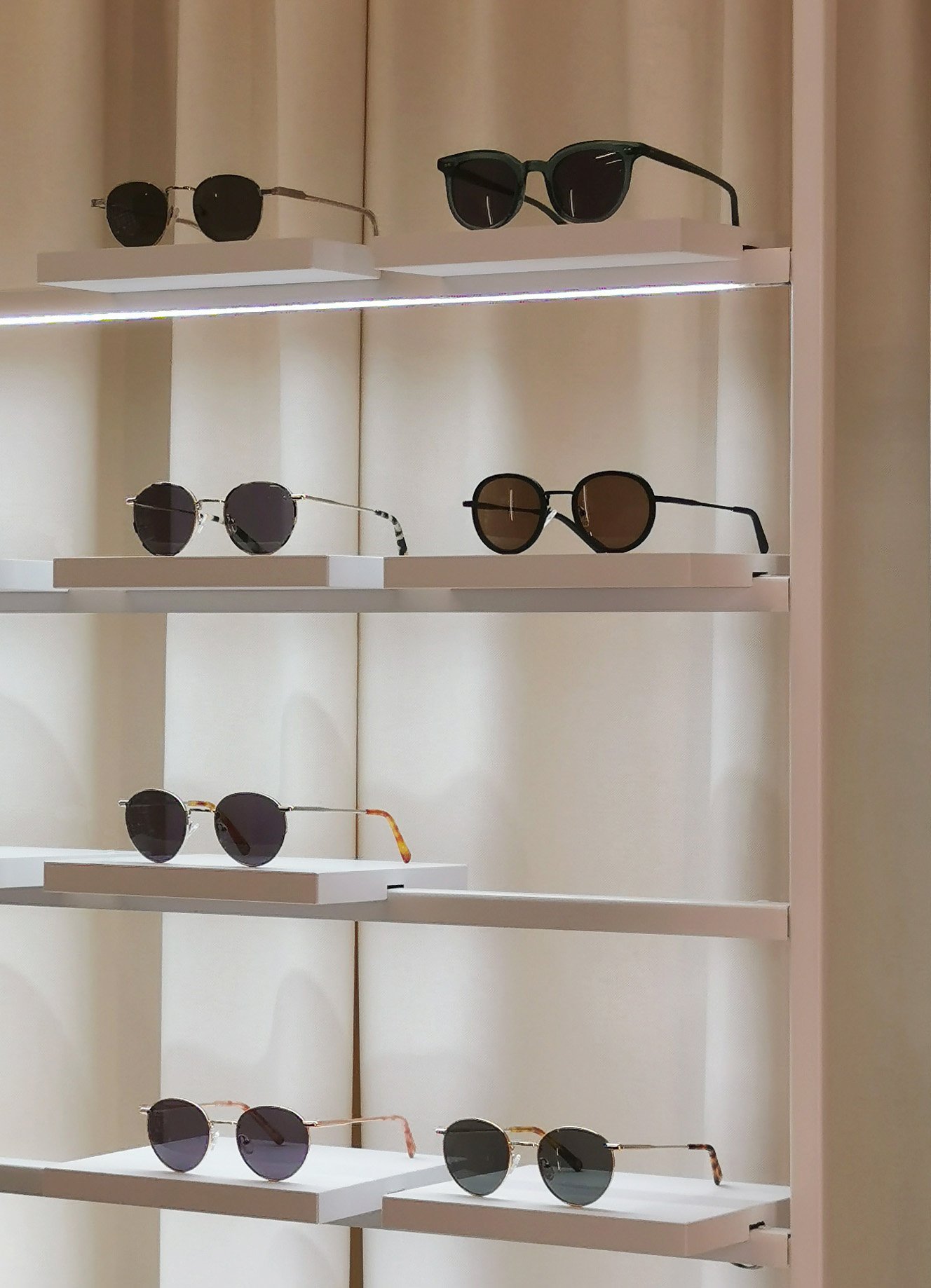
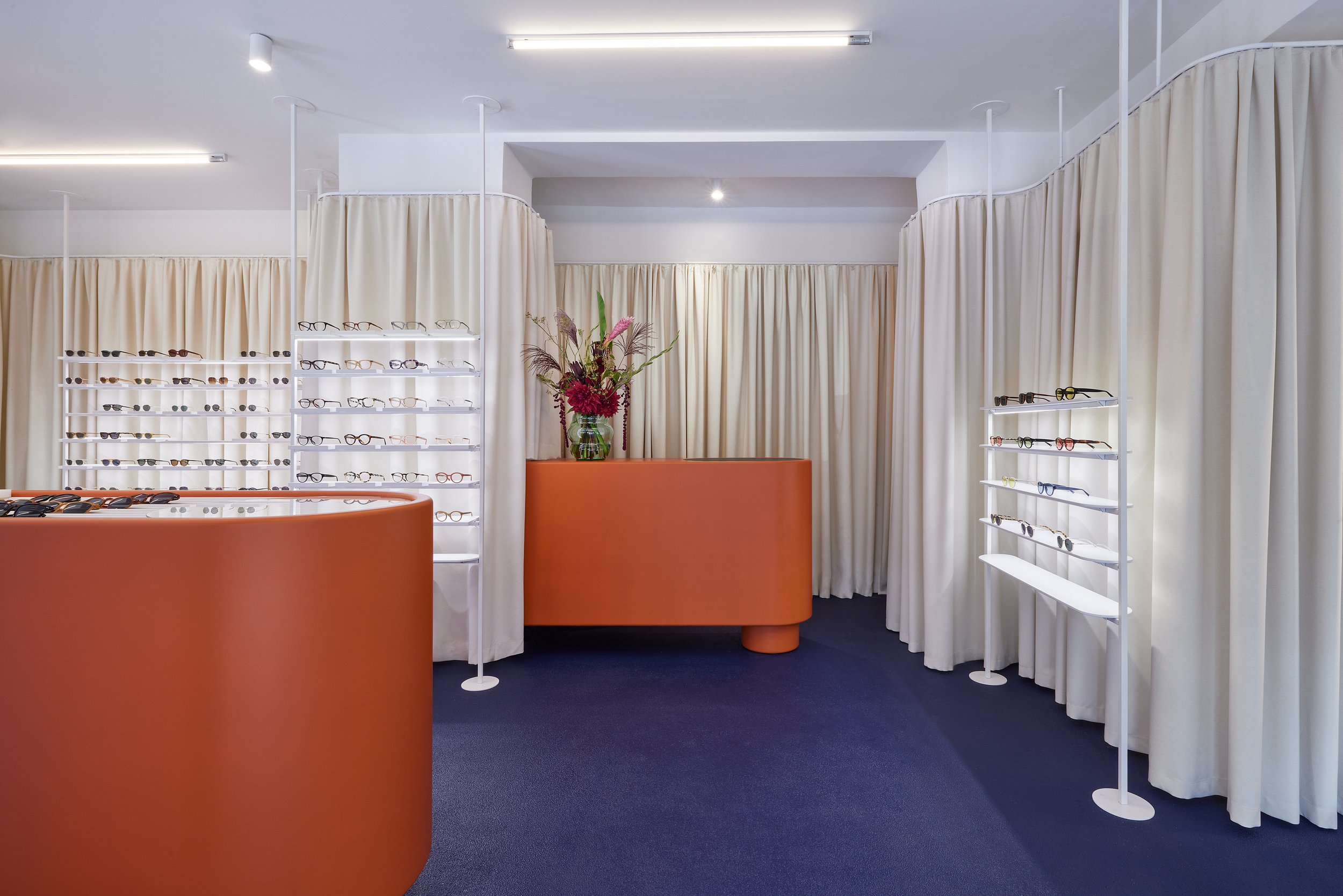
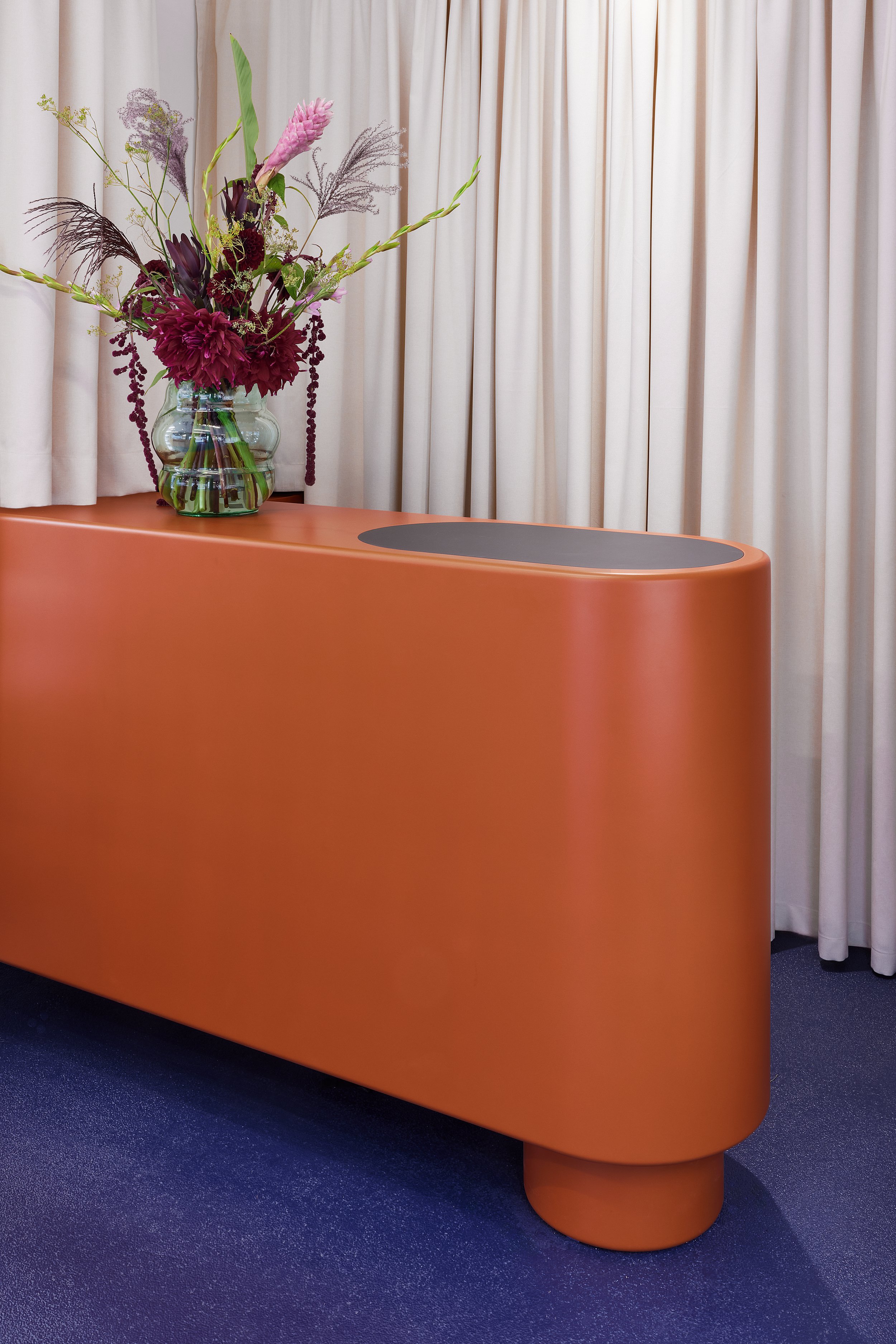
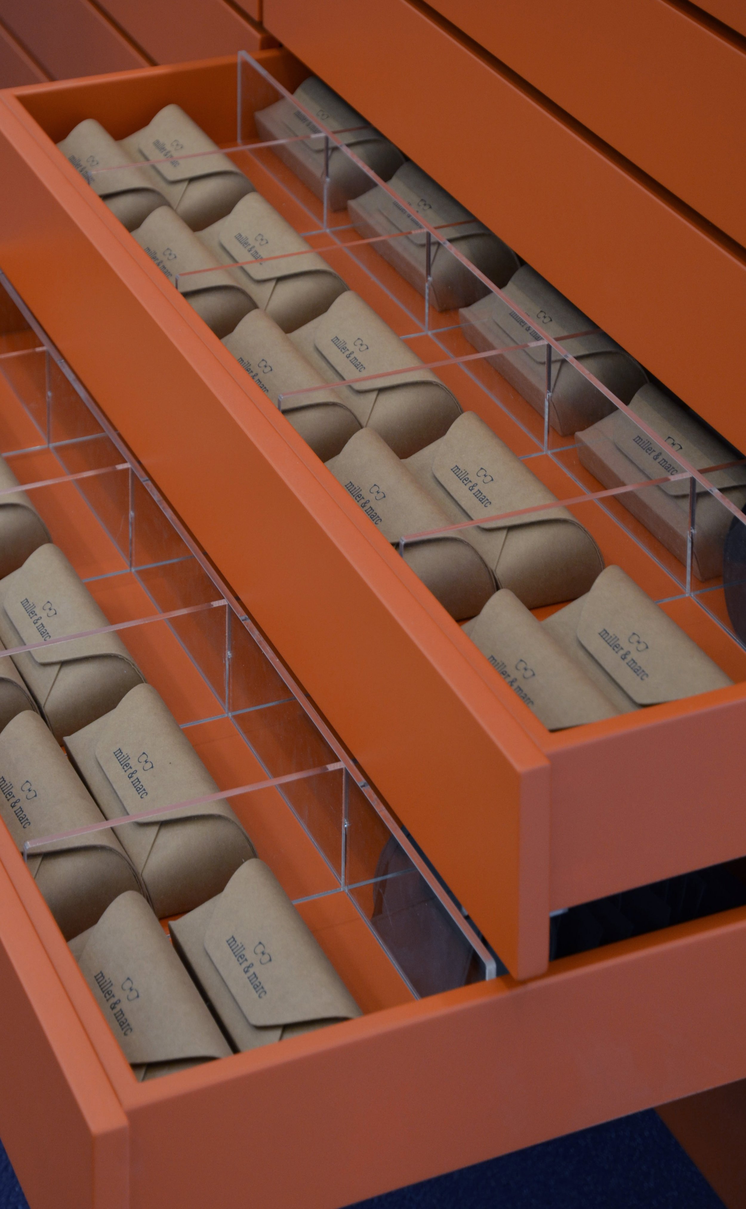
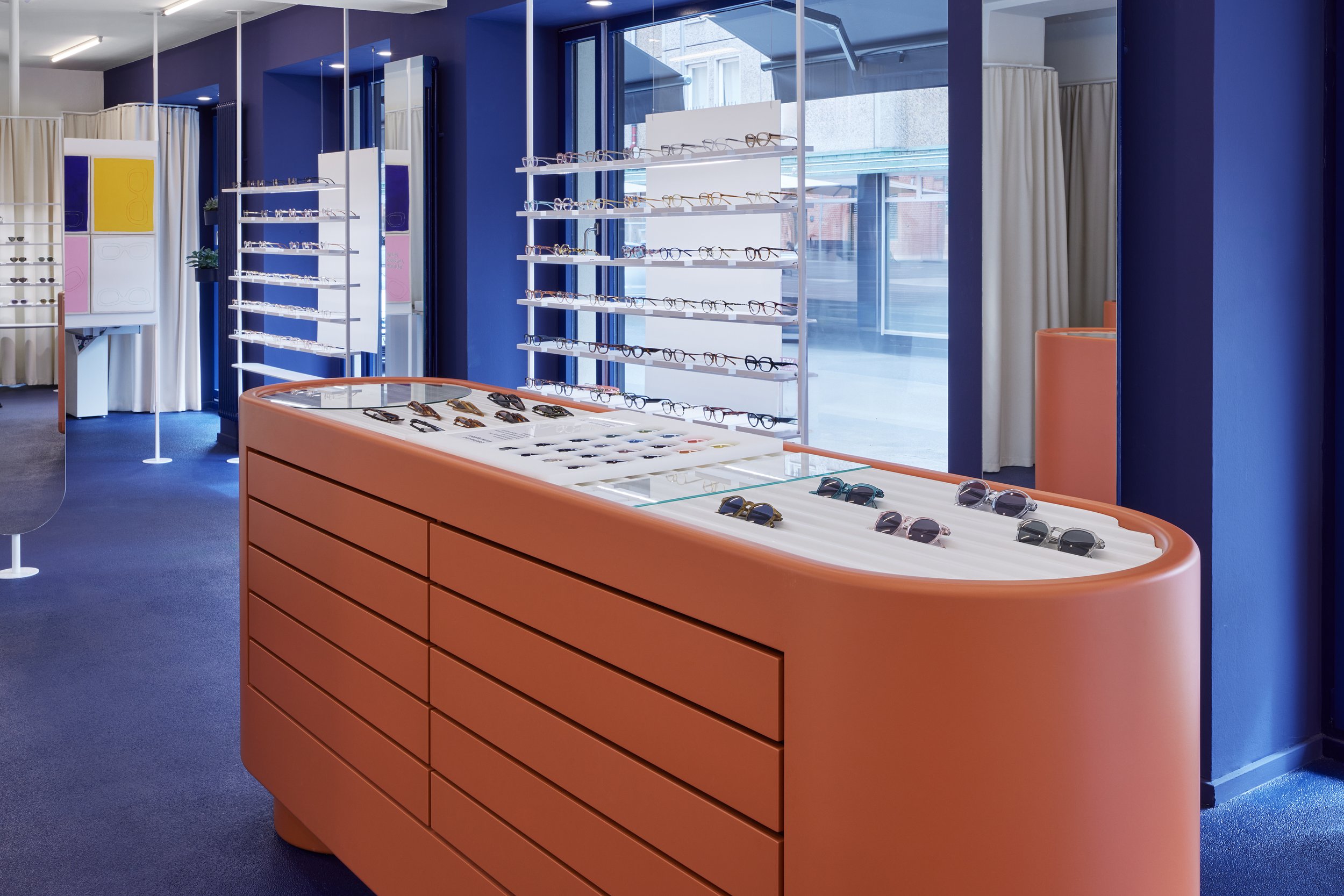
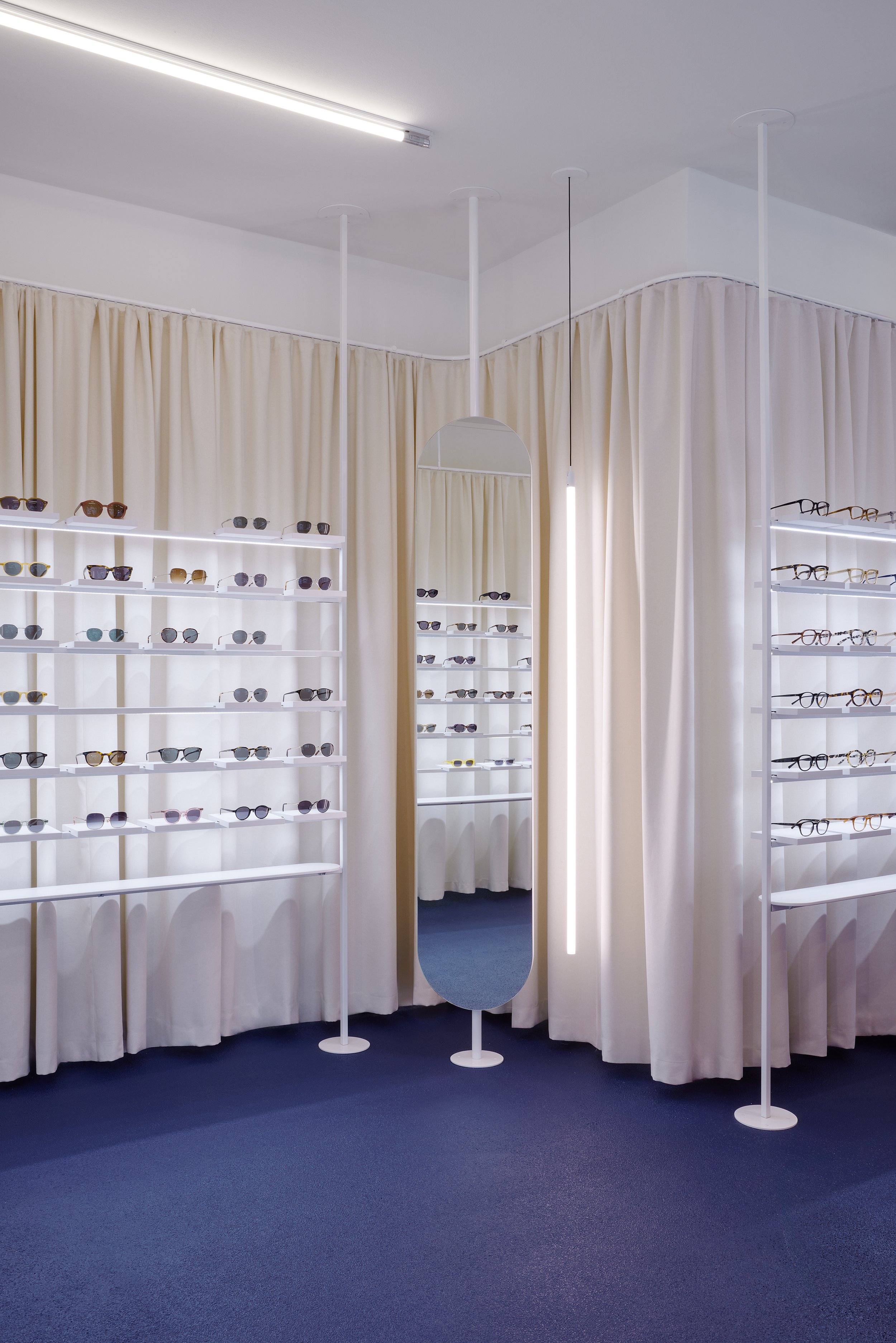
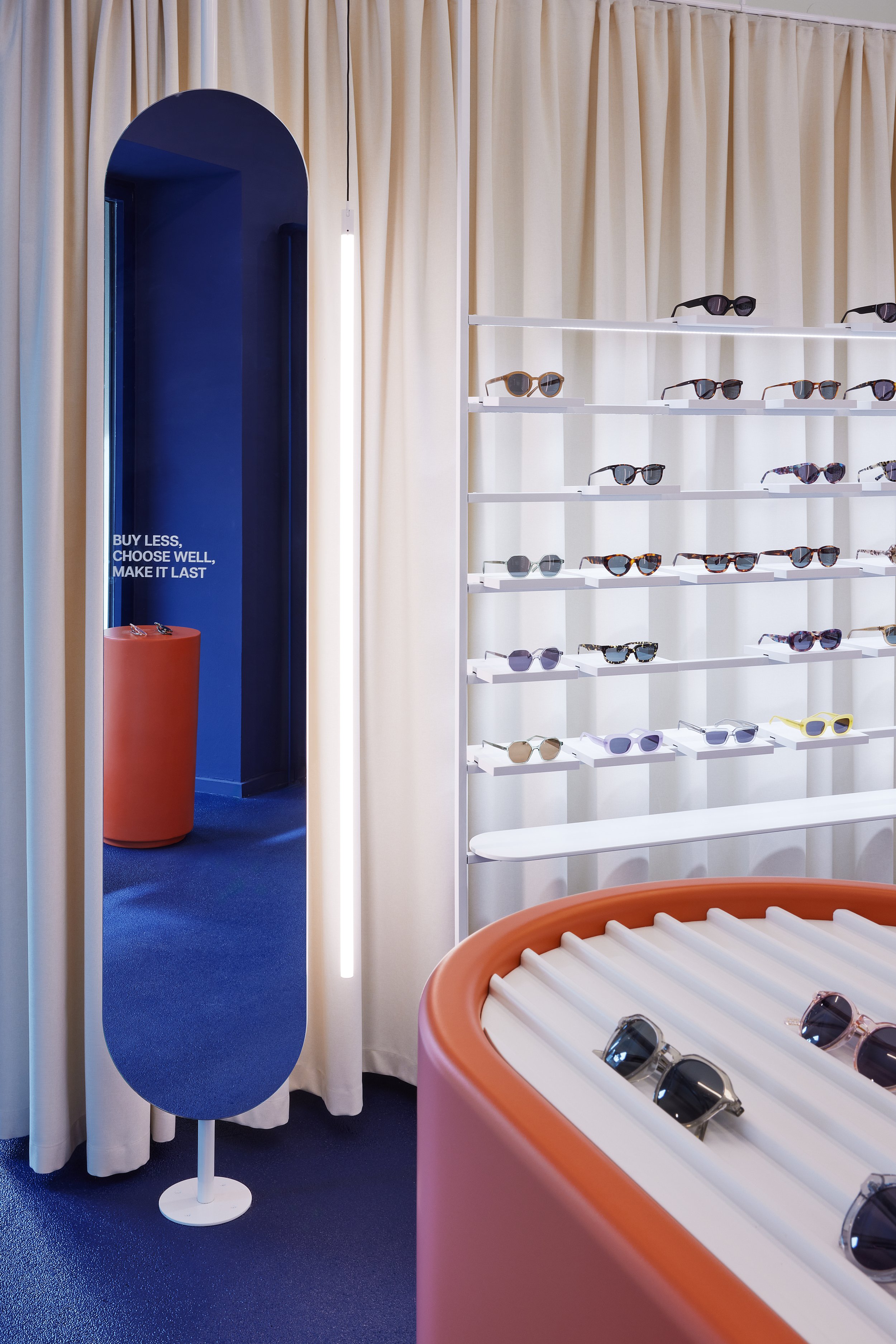
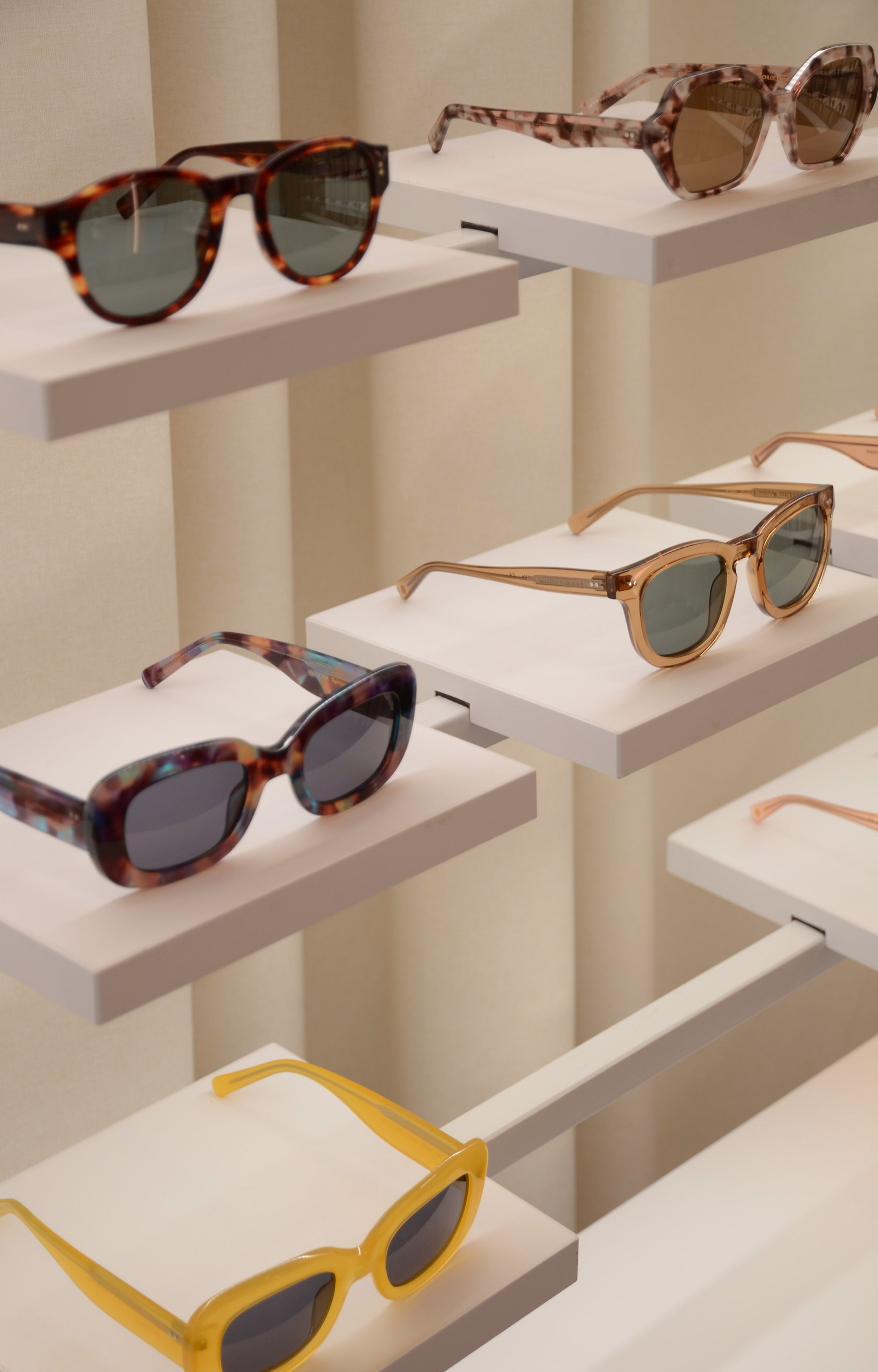
The centrepiece of the interior design is the custom designed terracotta-coloured retail furniture, which has an almost sculptural appearance due to its oval shape. It serves to display the current MILLER & MARC collections and is centrally located in the open salesroom. Delicate, white shelves are set against a sand-coloured curtain band that wraps itself around the space, with carefully placed lighting elements.
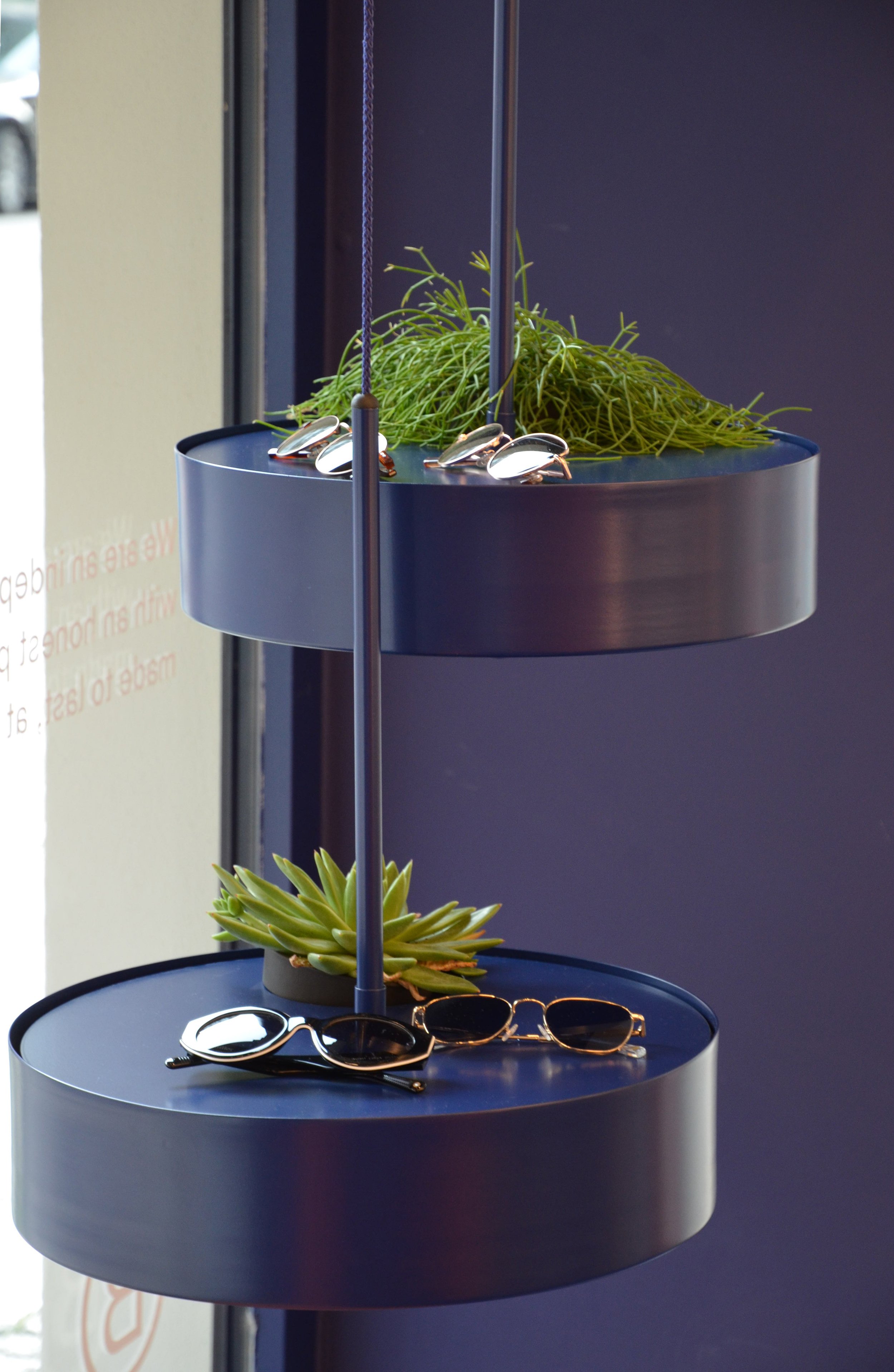
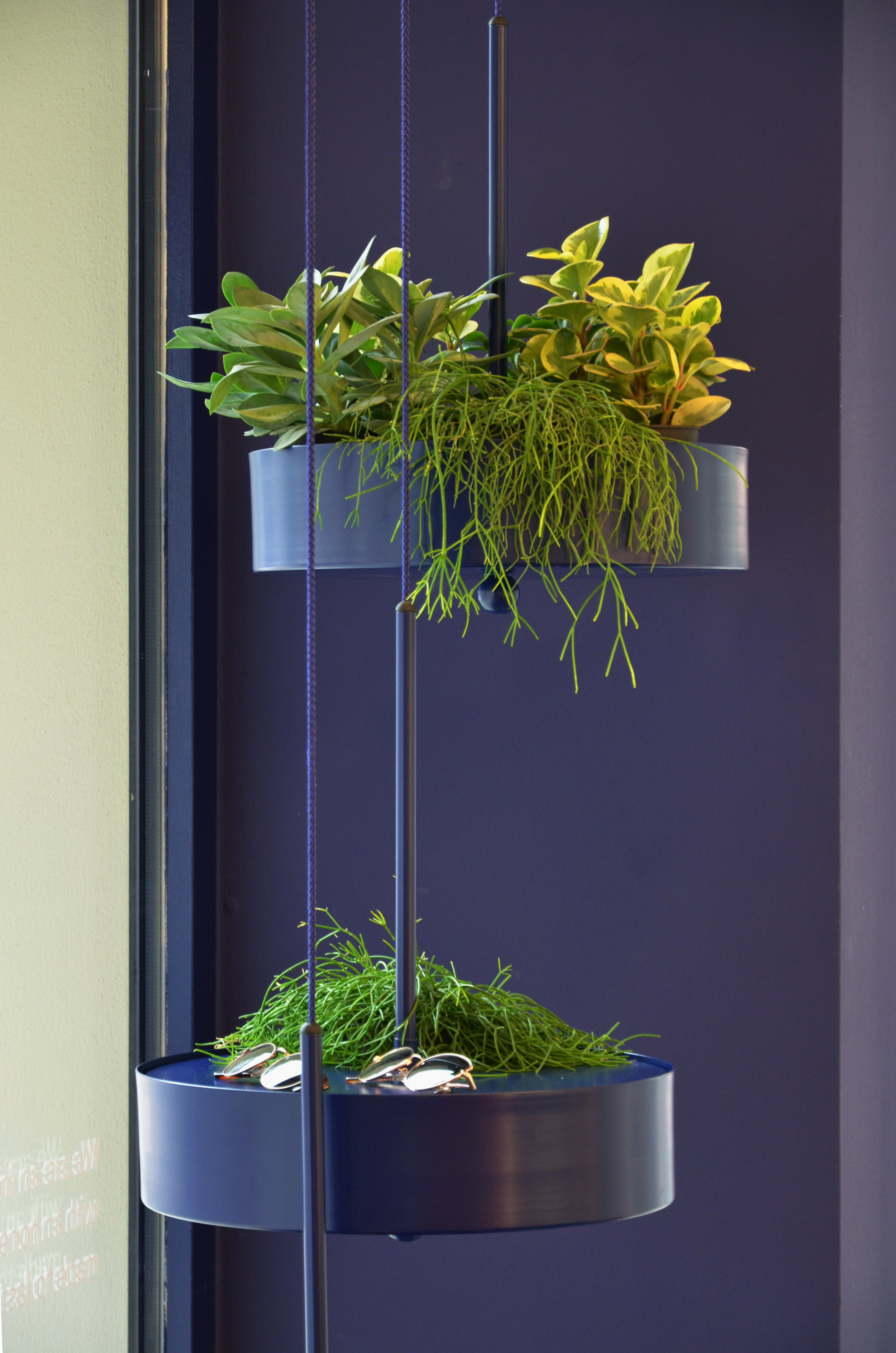
For this boutique, COORDINATION has designed custom-made retail furniture, which was produced locally in Berlin. Other designs, such as the cobalt blue plant hangers, seating furniture and strategically positioned full-height mirrors create a coherent spatial experience.
The clever zoning with free-standing furniture creates open lines of sight for visitors, who can be inspired by the brand‘s large variety of glasses and receive comprehensive consultation from the responsible optician on site.
In addition to local production, COORDINATION also focusses on reusing materials. The vertical displays, which originate from a former store in Spain, were lacquered in bright white and repositioned in front of the sand-coloured curtain. This sustainable design approach also reflects the corporate philosophy of MILLER & MARC, which has been focussing on recycled materials, shortened supply chains and durable products since its foundation. The brand is a B-Corp certified company since 2022.
A controlled mix of tactile and textile surfaces and the rich colour palette create a reduced and elegant spatial impression that centres its attention on both the products and the visitors.
Facts
| Client | MILLER & MARC S.L. |
| Assignment | Concept, design, planning and implementation of the retail concept |
| Design | Flip Sellin |
| Project Management | Flip Sellin |
| Team | Lukas Kurze, Max Fabian Woscyna, Lena Kramer, Isabel Redecke |
| Photos | Christoph Musiol |
